We can all agree that many websites are beautiful, but they don’t sell anything because they’re too focused on making a great first impression instead of creating a clear call to action.
Most people make the mistake of creating a header that is cute, clever, or interesting. But this type of header fails miserably at making your website stand out and get you more sales!
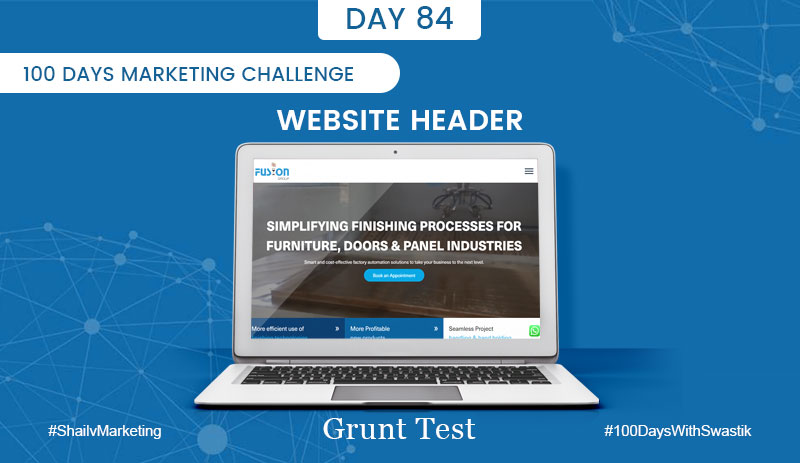
If your website header does not pass the grunt test, it’s time to change it.
This can be done by answering these three questions about what you offer on your homepage:
1. What do you offer?
2. How will it make customer life better?
3. What do they need to do next?
The right header makes the difference in getting customers to buy from you vs someone else who offers similar products or services.
A good header answers those three questions clearly and concisely so visitors immediately know what you have to offer them and how they can take action with just one click!
And remember, no matter how great your product is, if potential clients don’t understand why they should buy from YOU instead of going somewhere else for a similar service/product, it will not help you get sales.
So, does your website passes this grunt test?

